
CSS by backend
What each output format does with every CSS property, with rendered examples, the style inspector and live reload.
One stylesheet styles every output. SVG and PNG draw every value exactly (PNG is rendered from
the SVG). PowerPoint and Figma draw them as native, editable properties; where a format has no
equivalent, spinagram draws the nearest one and check or the render prints one warning naming
the backend, the property and the value.
Support matrix
✅ exact · ≈ nearest equivalent (see note) · — ignored
Nodes, groups, regions and lanes
| Property | SVG / PNG | PowerPoint | Figma / FigJam | Notes |
|---|---|---|---|---|
fill | ✅ | ✅ | ✅ | Solid colours. |
fill-opacity | ✅ | ✅ | ✅ | Alpha on the fill only; the outline stays opaque. |
stroke | ✅ | ✅ | ✅ | |
stroke-width | ✅ | ✅ | ✅ | |
stroke-dasharray | ✅ | ✅ | ✅ | PowerPoint stores the pattern relative to the line width (a:custDash), so it scales with stroke-width exactly as in SVG. |
border-radius | ✅ | ✅ | ✅ | Boxes and groups. Behavior symbols (states, decisions, …) keep their own geometry. |
opacity | ✅ | ≈ | ≈ | SVG fades the whole element. PowerPoint blends the fill with the slide background; Figma sets the fill paint opacity. Text and outline stay opaque in both. |
box-shadow | ✅ | ✅ | ✅ | One shadow: offset-x offset-y blur colour. Spread and inset are ignored. PowerPoint gets an outer shadow (a:outerShdw), Figma a drop-shadow effect. |
Text: ::title, ::body, ::label
| Property | SVG / PNG | PowerPoint | Figma / FigJam | Notes |
|---|---|---|---|---|
color | ✅ | ✅ | ✅ | Inherited from groups. |
font-size | ✅ | ✅ | ✅ | Feeds automatic sizing, so boxes grow to fit. |
font-weight | ✅ | ≈ | ≈ | PowerPoint has bold or regular only; Figma uses the style the theme maps to that weight (fonts.*.figma). |
font-style | ✅ | ✅ | ✅ | italic or normal. |
font-family | — | — | — | Checked, not applied yet: text keeps the theme font, and a family the theme does not embed is warned about once. |
Edges
| Property | SVG / PNG | PowerPoint | Figma / FigJam | Notes |
|---|---|---|---|---|
stroke, stroke-width | ✅ | ✅ | ✅ | |
stroke-dasharray | ✅ | ✅ | ✅ | |
opacity | ✅ | ✅ | ✅ | PowerPoint puts an alpha on the line colour. |
marker-start, marker-end: arrow, open-arrow, diamond, circle, none | ✅ | ✅ | ✅ | PowerPoint arrowheads triangle, arrow, diamond, oval; Figma stroke caps. |
marker-*: open-diamond | ✅ | ≈ | ≈ | Drawn as a filled diamond, with a warning. |
marker-*: bar | ✅ | ≈ | ≈ | No bar arrowhead in either: the end is drawn without a marker, with a warning. |
Values
| Form | Example |
|---|---|
Hex, rgb(), rgba(), CSS names | #DC2626, rgba(0, 0, 0, .25), teal |
| Theme tokens | fill: primary-soft |
| Custom properties | :root { --brand: #0F766E } then var(--brand); var(--warning) falls back to the theme token warning; var(--x, #fff) takes a fallback |
| Lengths | 4, 4px (pixels on the 1920 × 1080 canvas) |
An unresolvable colour stops the render with file, line and selector. An unknown property, an empty or invalid value and a negative width are skipped with a warning.
Examples
Every example is one diagram of
examples/styling/gallery/gallery.py
plus its stylesheet. Render them all with spinagram render examples/styling/gallery -f svg,pptx,figma.
Fills, strokes and corners
Theme tokens and plain colours side by side.
/* Fills, strokes and corners: theme tokens or any CSS colour. */
.soft  { fill: primary-soft; stroke: primary; }
.round { fill: #ECFDF5; stroke: #059669; stroke-width: 4; border-radius: 40px; }
.sharp { fill: #FFF7ED; stroke: #EA580C; stroke-width: 6; border-radius: 0; }

Dashes and transparency
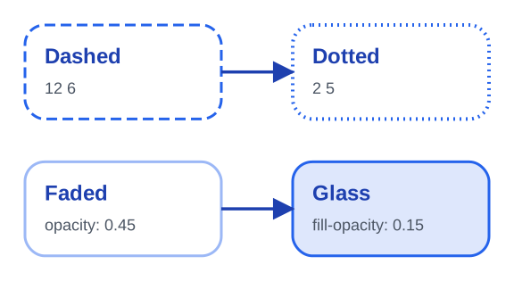
opacity fades the whole node; fill-opacity only its fill.
/* Dash patterns and transparency. */
.dashed { stroke-dasharray: 12 6; }
.dotted { stroke-dasharray: 2 5; stroke-width: 4; }
.faded  { opacity: 0.45; }
.glass  { fill: #2563EB; fill-opacity: 0.15; stroke: #2563EB; }
Shadows
A blurred lift, a glow without offset and a hard offset without blur.
/* One drop shadow per element: offset-x offset-y blur colour. */
.lift { box-shadow: 0 10px 18px rgba(15, 23, 42, 0.28); }
.glow { stroke: #F59E0B; box-shadow: 0 0 22px rgba(245, 158, 11, 0.7); }
.hard { box-shadow: 8px 8px 0 #1E3A8A; border-radius: 0; }

Edges and markers
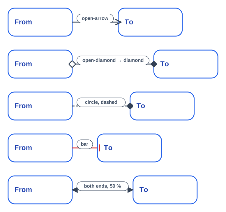
Each end takes its own marker. bar and open-diamond fall back in PowerPoint and Figma.
/* Edge strokes and arrowheads at either end. */
edge { stroke: #334155; stroke-width: 3; }
edge.open     { marker-end: open-arrow; }
edge.diamond  { marker-end: diamond; marker-start: open-diamond; }
edge.circle   { marker-end: circle; stroke-dasharray: 8 5; }
edge.bar      { marker-end: bar; stroke: #DC2626; }
edge.both     { marker-start: arrow; marker-end: arrow; opacity: 0.5; }
edge::label   { color: #475569; }
Text
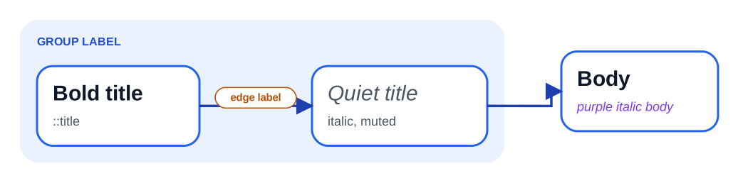
Pseudo-elements target titles, bodies and labels; font-size resizes the box.
/* Text parts: ::title, ::body (nodes), ::label (edges and groups). */
node::title   { font-size: 30px; font-weight: bold; color: #0F172A; }
.quiet::title { color: text-muted; font-weight: normal; font-style: italic; }
.note::body   { color: #7C3AED; font-style: italic; }
edge::label   { color: #B45309; font-size: 15px; font-weight: bold; }
group::label  { color: #1D4ED8; }
Custom properties and tokens
var(--alert) is not declared, so it falls back to the theme token alert.
/* Custom properties on :root; var(--x) falls back to the theme token "x". */
:root  { --brand: #0F766E; --brand-soft: #CCFBF1; }
node   { fill: var(--brand-soft); stroke: var(--brand); stroke-width: 3; }
.risky { stroke: var(--alert); fill: var(--alert-soft); }
.muted { stroke: border; fill: neutral-soft; }

Selectors and inheritance
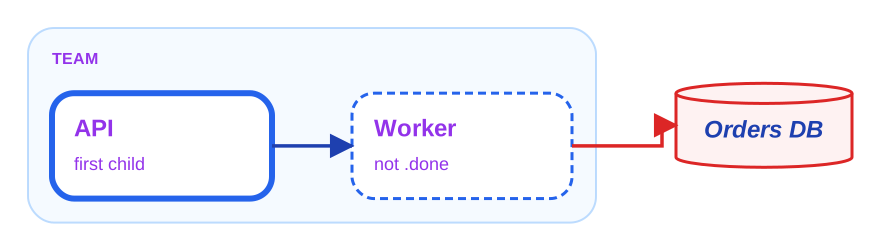
The group sets color once; both titles inside inherit it. The data node matches [kind=data].
/* Ids, attributes, combinators, pseudo-classes and inheritance from groups. */
group.team               { color: #9333EA; fill: #EFF6FF; stroke: #93C5FD; }  /* color is inherited */
group.team > node:first-child { stroke-width: 6; }
node:not(.done)          { stroke-dasharray: 8 5; }
#db                      { fill: #FEF2F2; stroke: #DC2626; }
edge[to=db]              { stroke: #DC2626; }
[kind=data]::title       { font-style: italic; }
Behavior kinds
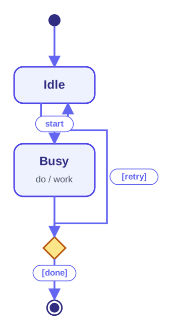
Node kinds (state, choice, initial, final) are type selectors.
/* Behavior diagrams: select by node kind and by region type. */
state              { fill: #EEF2FF; stroke: #4F46E5; }
state::title       { color: #312E81; }
initial, final     { stroke: #312E81; }
choice             { fill: #FDE68A; stroke: #B45309; }
edge               { stroke: #6366F1; }
Inspect computed styles
spinagram check --styles explains every element: its computed values, then the rules that set
them from the winning one down, overridden declarations struck through, var() resolutions,
inherited values and the text pseudo-elements. Narrow it with a selector:
spinagram check --styles examples/styling/styled.py --select "#payments"C01 · Payments, styled with CSS cascade: examples/styling/brand.css node#payments.critical [box] 'Payments' computed border-radius 10 fill #FEE2E2 stroke #DC2626 stroke-width 4 box-shadow 0 6 12 #000000 / 0.25 node.critical examples/styling/brand.css:6 (0,1,1) fill: #FEE2E2 stroke: var(--danger) → #DC2626 stroke-width: 4 box-shadow: 0 6px 12px rgba(0, 0, 0, 0.25) node examples/styling/brand.css:4 (0,0,1) border-radius: 10px ::title color #7F1D1D node.critical::title examples/styling/brand.css:7 (0,1,2) color: #7F1D1D node::title examples/styling/brand.css:5 (0,0,2) color: var(--accent) → #7C3AED 1 diagram(s), 0 issue(s)
| Option | Effect |
|---|---|
--styles | Print the style report before the usual checks |
--select SELECTOR | Only elements matching the selector (".critical, edge.async") |
--json | The same report as JSON, the format the live inspector reads |
--color auto|always|never | Colour and swatches; auto colours a terminal unless NO_COLOR is set. Without colour, overridden declarations end in (overridden) |
Plain spinagram check also lists selectors of your own stylesheets that match nothing as
info: unused selector lines. They are hints, not issues: the exit code ignores them. Theme
stylesheets are not checked this way, since a theme styles kinds a diagram may not use.
Live inspector and live reload
In spinagram serve, press Inspect (or i). Hovering outlines the element
under the pointer; a click opens its classes, attributes, computed style and source rules, the
same report as check --styles. With nothing selected, the panel lists the element tree, the
cascade order and unused selectors. Esc clears the selection; dragging still pans.
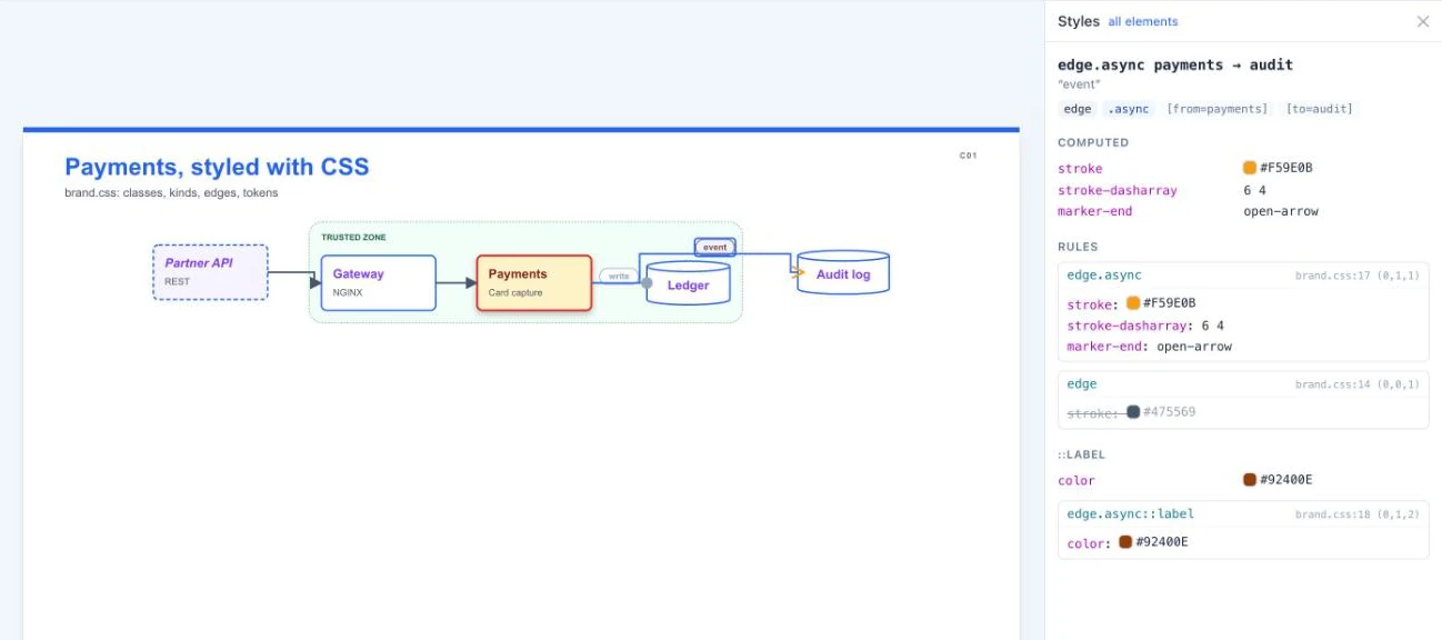
Saving a stylesheet re-renders exactly the diagrams whose cascade includes it, and the inspector
refreshes with the selection kept. That covers .css files next to the specs, stylesheets
referenced from elsewhere (their folders are watched too), inline css: in a folder's
_defaults.yaml and the theme's theme.css, which re-renders everything.